How to Customize Summary Block Borders in Squarespace
Squarespace is a popular website builder known for its user-friendly interface and stunning design templates. One of its standout features is the summary block, which allows you to showcase collections of content on your website. However, while the summary block is a powerful tool, the default design options may not always align with your vision for a unique and eye-catching website. That's where customization comes in!
In this tutorial, we'll explore how you can add borders to summary blocks in Squarespace to create a visually appealing and personalized design. Whether you're using Squarespace 7.1 or an older version built with 7, the techniques we discuss here will work for both. So, let's dive in and make your summary blocks look awesome!
Summary Selectors
To begin adding borders to your summary blocks, you'll need to understand the selectors that control their appearance. Selectors are like labels that identify specific elements on your website. In this case, we'll focus on the selectors associated with summary blocks. Armed with this knowledge, you can leverage custom CSS (Cascading Style Sheets) to modify various properties and values.
The three selectors we will be working with are:
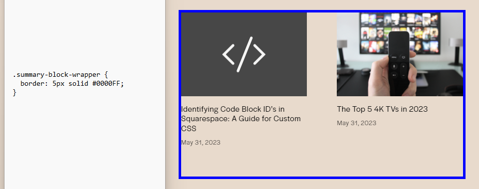
.summary-block-wrapper (Entire summary block)
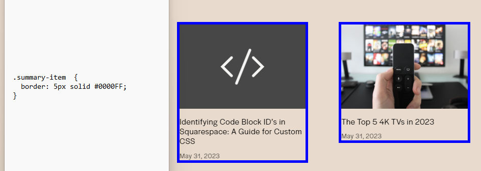
.summary-item (Summary photos with text)
.summary-thumbnail (Summary photos)
For instance, you might use the following code snippet to add a blue border to your entire summary block:
.summary-block-wrapper {
border: 5px solid #0000FF;
}
Related posts
If you want a border surrounding the photos and text, you can use the following:
Note: Make sure to double check the padding
.summary-item {
border: 5px solid #0000FF;
}
And lastly, if you want to frame just the photos with a border, you can use the following code:
.summary-thumbnail {
border: 5px solid #0000FF;
}
Targeting Individual Summary Blocks
If you want to target individual summary blocks (You can find more on how to target individual blocks here), simply insert the block id like this:
#block-yui_3_17_2_1_1685668981656_3723 .summary-block-wrapper {
border: 5px solid #0000FF;
}
In conclusion, by learning how to add borders to summary blocks in Squarespace, you can take full control of the visual aesthetics of your website. Customizing summary blocks allows you to align them with your unique vision and create a stunning and personalized design. Armed with knowledge of selectors and the power of custom CSS, you can modify various properties and values to transform the appearance of your summary blocks. Whether you want to add borders, change background colors, or create subtle effects, the possibilities are endless. So go ahead and unleash your creativity to make your summary blocks truly stand out and captivate your website visitors.
As always, if you have any questions, you can reach out to me here! If you would like to learn more about customizing summary blocks, you can email me at augustus@augustussecrest.com. I can provide you a full list of summary block selectors free of charge!


